8 COLOR PALETTES INSPIRED BY OUR NATURAL LIGHT STUDIO IN DALLAS
At Brightside Studios, we've crafted numerous color palette combinations using our vignettes, props, and backdrops. Each color palette in our studio was designed to cater to the diverse needs and creative visions of the photographers and creatives who create work in our studio. As we put together the elements comprising these color palettes, we carefully considered the various types of photoshoots that best complement each palette and the specific locations within our studio. Here are 8 color palettes in our studio to inspire your next shoot.
CITRUS SUMMER
This color palette features some of our brand colors, so we might be just a little biased. The greens and oranges of this color palette feel fresh and full of life. We wanted our brand to be fun, happy, bright, and bold. The Brightside Studios branding is actually derived from a Kumquat Tree photo from the owner’s print collection. You can check that out here.

Mossy Boulder
The greens and grays in this palette have such a calming effect. The color palette suggests balance and stability with a bit of earthiness. The green adds a subtle pop of color while the gray maintains a timeless backdrop. The plants in our studio can be used to create a more natural element for branding photoshoots in our studio.

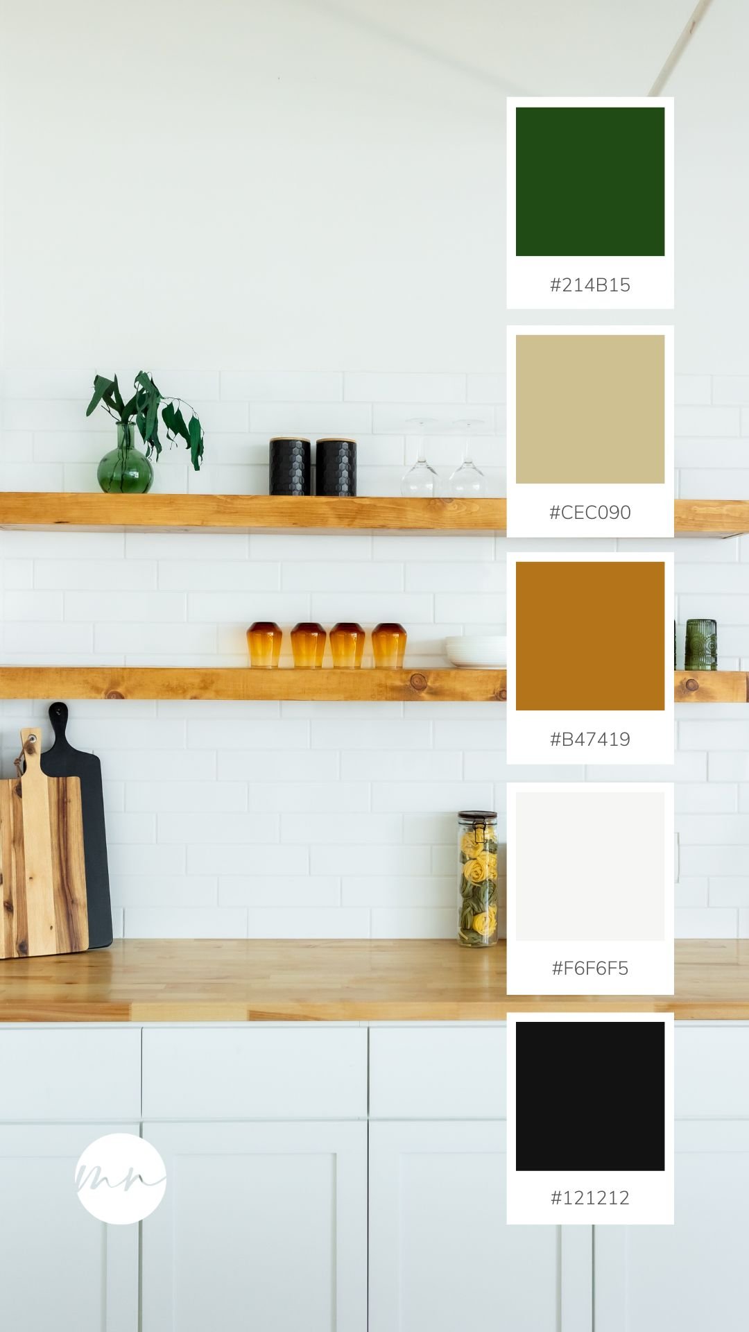
FRESHLY CLEANED KITCHEN
The combination of green and light brown give this vignette a clean and inviting ambiance. We wanted a natural yet clean feel for our kitchen space, so we stuck with neutral backsplash, natural wood countertops and shelves, and pops of deep greens.
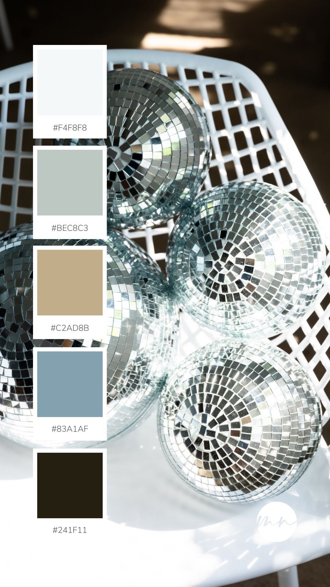
DISCO BY THE SEA
The blue and tans of this color palette remind us of a nice and fun day at the beach with friends. It inspires photoshoots that feel carefree and is there anything more carefree than disco balls? The shimmering lights bring an extra layer of excitement and whimsy to shoots.
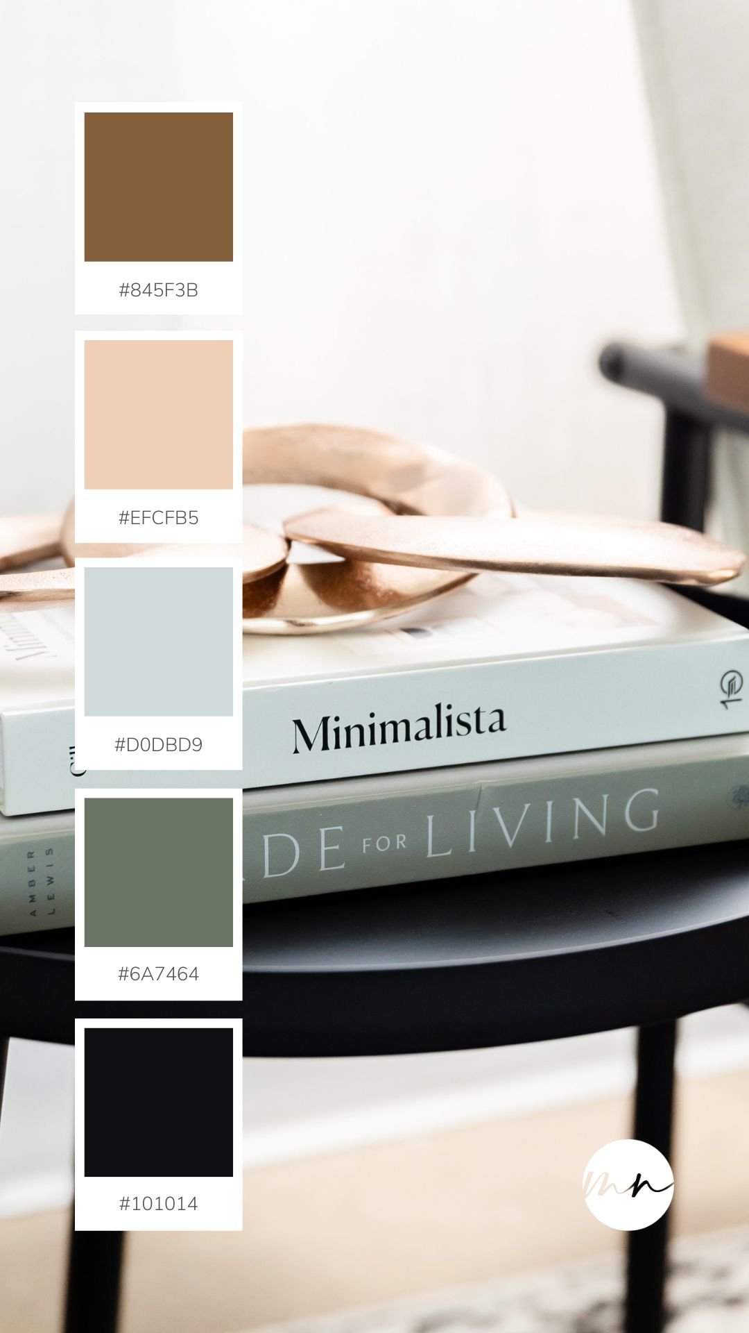
Modern Minimalist
Sleek and contemporary are the first things that come to mind when we look at this color palette. The warm tans and the cool greys of this palette create an inviting atmosphere that’s perfect for cozy family shoots, yet sleek for modern personal branding sessions.

COASTAL MINIMALIST
This color palette exudes a warmth with a coastal flair that makes us feel at peace. The book props are perfect for this more personable and relatable branding photoshoots. If you’re looking for that down-to-earth feeling, the color palette this area of our studio provides is it!
JEWEL-TONED Bouquet
If your shoot is centered around energy and playfulness, the vibrant greens, pinks, and yellows in this color palette will inspire you. This color combo radiates joy and liveliness. You can use any of the backdrops in this area to create the perfect background for your celebratory photos.

DAY TRIP IN ITALY
The shades of orange and browns in the color palette alongside our studio Vespa makes us feel adventurous. This is the perfect prop for shoots that have a spontaneous and exciting feel to them (if you use our Vespa as a prop, please be careful, she is fragile). Any photos that include this prop and/or color palette are defintely going to pop!

If you want to use any of the fun props we have at our studio, reserve the studio space here or shoot us an email at info@brightsidestudios.com.